Wednesday, September 12, 2007

Rationale & story of my MTV


Story of my MTV


Tommy was being bullied by school mates since he was a child. His dad was died in prison and he was brought up by his uncle. Before his dad passed away, Tommy promised him not to do the things he had done, as well as to keep away from troubles. As a result, he did not get into any fight with others under any circumstances. Until one day, his girlfriend Becky was rapped by three villains.
This time he could not tolerant any more. The villains did not expect the coward, Tommy, to take revenge and they were all beat to death. Tommy showed his father that, sometimes he has to fight to be a man.

Happy Ending.


Rationale for the CD cover design

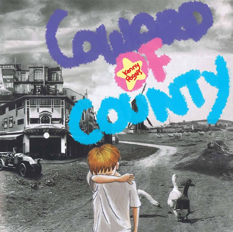
The central attention is Tommy which is in colours.
The background is mixed with different pictures from different parts of county, in black and white.
The title is in bright and warm colours in the sky of the county.

When picture loses colours, it conveys loneliness. The child is seen to be abandoned by the whole world. He was the all by himself to fight the troubles. Besides to focus attention on the child, the colour contrast also shows the character of the boy that he may look useless and small, but he has strong mind and once he fight back he will definitely gets what he wants.

The title is display in such colour scheme is to allocate to the mood of music. The song"Coward of county" by Kenny Rogers is medium tempo and belonging to country type. It conveys a happy mood instead of serious mood.

In addition, this song is targeted at young children which is about the same age as Tommy when he got bullied. As a result, I also use the icon of a star which is like a badge in the centre of "O" in "Coward of County. This will attracts the attention of the children.

development 3


In the meanwhile, I have found some pictures which are fitted to the images of a county. They are really old pictures that have taken 40 or 160 years ago.. By looking into the pitures, I was brought back to the eras and it was exciting to imagine life up there. Some pictures look really creepy as most of them were black and white, it also reminds me of pictures from funerals.

development stage 2


retreived from http://www.blaettche.de/lauschangriff/Cover/datsuns.jpg


As I have mentioned in the previous post, that Philippe Starck likes to combine elements which are vastly different in nature to surprise me, I am going to adapt this design principal in my final assignment. After giving a tour to HMV at cineleisure, I got some inspirations from the Pop and Rock music session, and one of them is the cover design of The Datsuns' "outta sight outta mind". I thought of using one of my frames


to combine with some old photos of street sences to create the lonely feel like the Datsuns' album.

Final assginment Development stage 1


My final assginment is to design a CD cover for my animatic storyboard of Coward of County by Kenny Rogers. These two above are my drafts for the CD cover.

Monday, September 10, 2007


In my storyboard drawing, I use a lot of warm colours to see the characters in a happier side of perspective. The warm colours and soft tones bring out hope from the dark stories, believing that everyone is being loved.
Mable's design philosophy:
The most sinere design comes from the penil in your hand.


Mable's design style


In my storyboard drawing, I use a lot of warm colours to see the characters in a happier side of perspective. The warm colours and soft tones bring out hope from the dark stories, believing that everyone is being loved.
Mable's design philosophy:
The most sincere design comes from the pencil in your hand.

Philippe Starck. His design styles


Oyster bar
Peninsular Hotel (HK) 1994
retreived from
"Philippe Starck" by Judith Carmel-Arthur


Bathroom design in Peninsular Hotel (HK)
1994

retreived from
"Philippe Starck" by Judith Carmel-Arthur


Dr Skud fly swatter, 1998, thermo plastic resin
retreived from


Philippe Starck's vivid imagination has produced some of the twentieth century's most outrageous and sought-after object of desire. I categorise his design style belonging to postmodernism. (http://www.the-artists.org/ArtistView.cfm?id=239B65F7-C5CF-11D4-A93800D0B7069B40)
In his furniture designs, there are a lot of smooth curves and arcs to give them a sense of liveness, as thought the chairs and tables can move in the next moment. In our literal imagination, stainless steel are hard and stiff however the unusual curves soften the medium visually with Starck's creation. He also likes to combine two very different element in his design, such as the Dr Skud fly swatter. The swatter printed with human complexion makes you think twice before you use it to kill the flies.
More about Philippe Starck